Typing About Typography
My thoughts on Typography and the endless possiblities to ...
Let's be honest, when most people praise a poster or advertisement for its great graphic design work, they are usually talking about imagery or photography, not how the actual wording or subject looks. Which does make sense in some ways, I mean "graphics" is in the career's name and all, but it is rather sad that the average person does not understand nor do they care about all of the work that can go into the design of typography. I feel like typography is underappreciated outside of the graphic design world, so I would like to take the time to write a snippet of my thoughts on typography as well as some of the typographic projects I have done while at Liberty University.
Drop Caps and Bold Letters

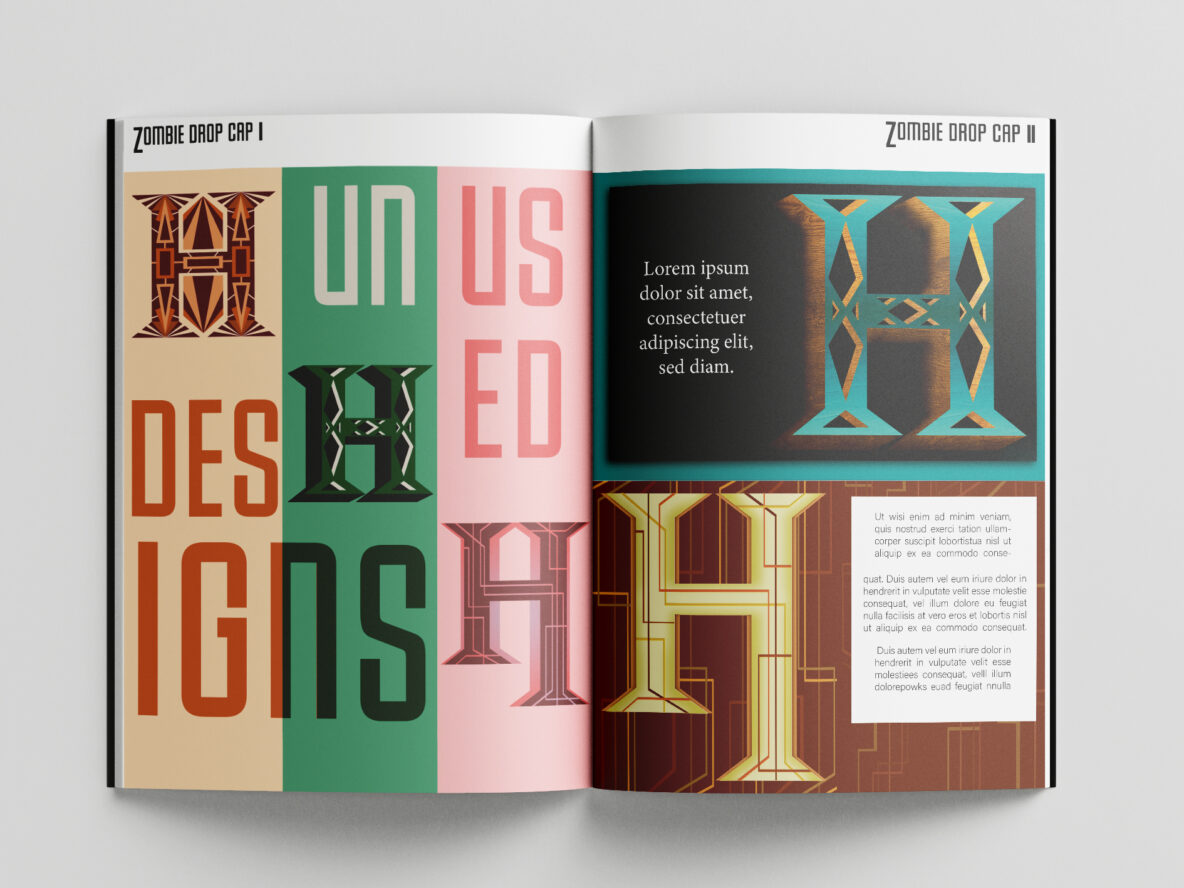
One of my most recent projects featuring typography would be the Zombie Drop Cap Exercise from my ARTS 424 class. Drop caps are such an interesting concept that I think gets written off too easily because they are seen as "old timely." A visually unique and compelling way to start out a new paragraph, drop caps have been used to breath new life into long form paragraphs and documents for centuries. . Look no further than the Declaration of Independence, and the fact that the average American can only recite the giant "WE THE PEOPLE" part of it from memory, to understand how to use this type of visual grab effectively. It can be easy to see now why this type of typography is underappreciated.
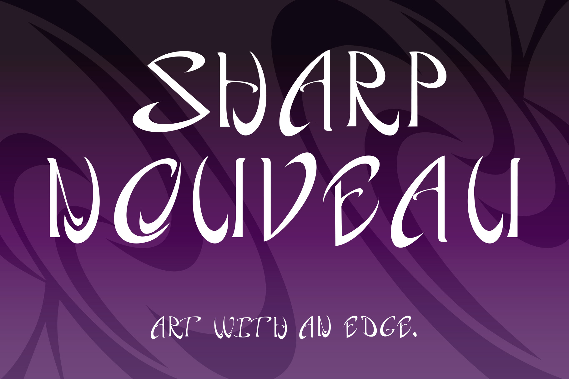
Decorative Typefaces
Decorative typefaces were basically born alongside graphic design. The entire point of a decorative typeface is to look decorative and unique, and thus these typefaces go hand in hand with all kinds of graphic design endeavors. You'd be hard-pressed to find a decorative typeface that has no personality or quirk to it. Even the jokes recognize decorative typefaces as iconic: I can't go but for so long researching graphic design-related imagery online without seeing another version of the classic "graphic design is my passion" joke with bad or lack luster decorative typefaces.
Letters That Convey Emotion
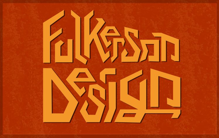
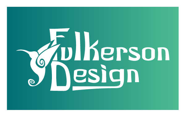
During the brainstorming phase for the brand Fulkerson Design, I came up with a couple different ideas for what it would look like, and this typeface/logo was my second-best pick. The typeface itself is so energetic and wacky, and it feels like it should make no sense but also that it flows together to create a cohesive picture. This is what I believe is so often overlooked when it comes to typography in graphic design: the ability to use typefaces to communicate a message just as powerfully, if not often more so, than the images commonly associated with graphic design. Again, another reason why typography is underappreciated.
