Culture Check: App Development
All About CultureCheck
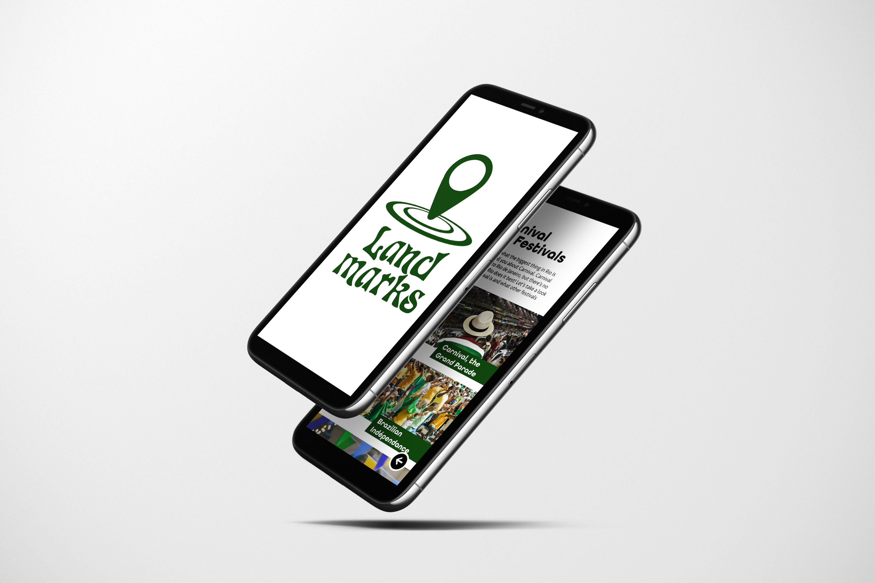
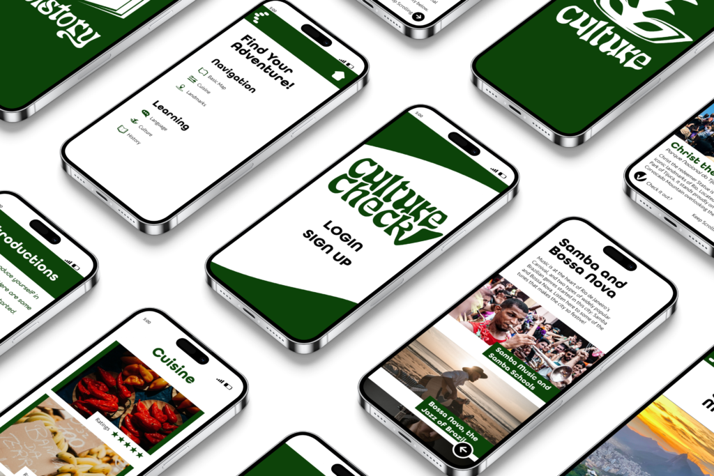
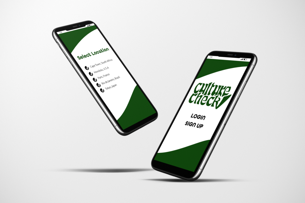
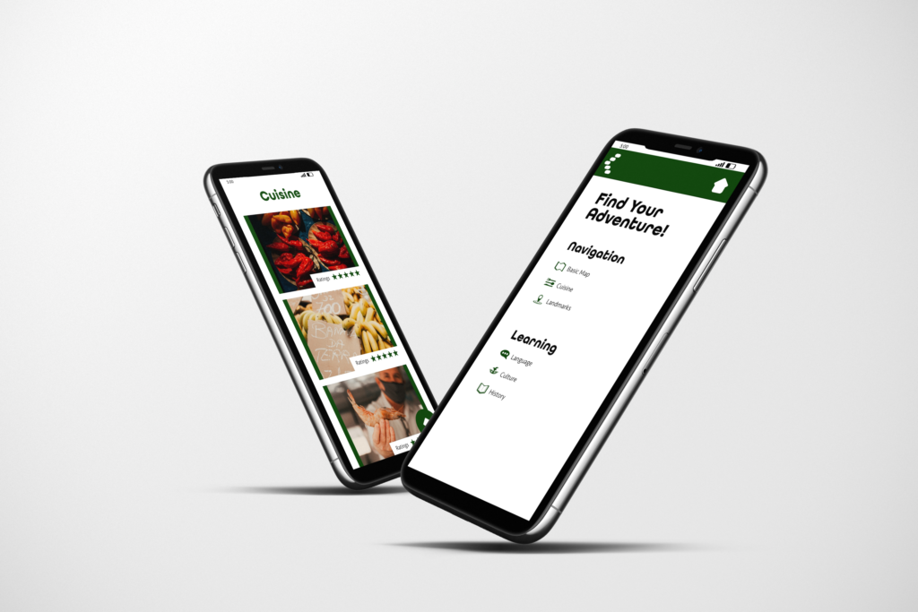
Culture Check is a conceptual travel app that is designed to direct users to the cultural hotspots of their travel destinations. The app highlights key cultural landmarks, customs, cuisines, and festivals while also acting as a travel guide for popular destinations. For the purpose of demonstrating the app, I chose Rio de Janiero, Brazil, due to its rich cultural history and popularity.
Culture Check: Pages and Features
Brand Elements
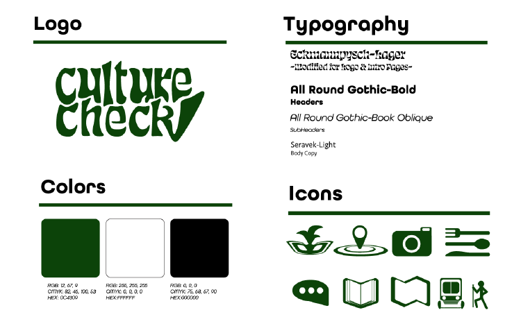
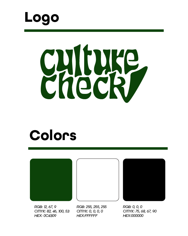
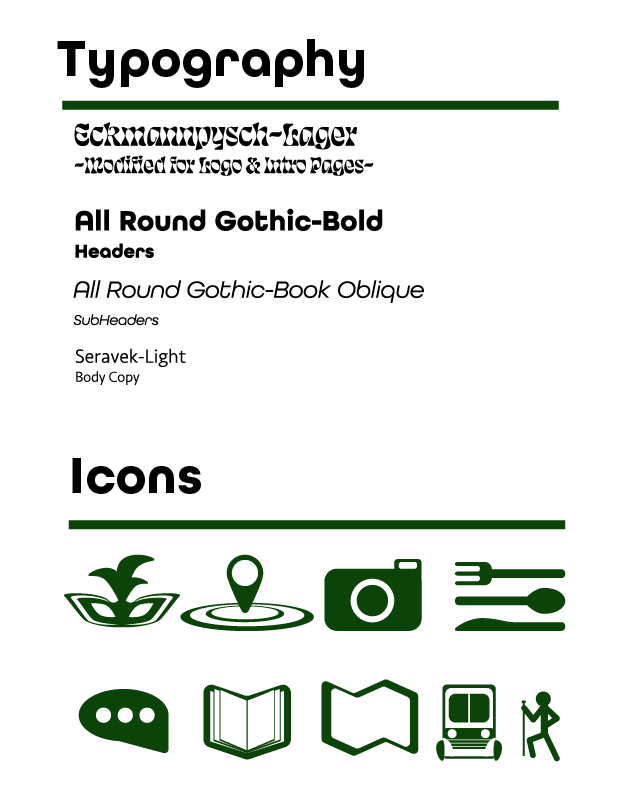
The restricted color palette of the app was chosen as to not distract the user from the core content of the app. I chose green, white, and black because it is an inviting color palette that also conforms to WCAG accessibility standards. The illustration style is designed to be simple but still full of character, with a minimalistic approach to further support the content while still being engaging. The typeface Echmannpysche was modified for the logo and subsequent category cover pages to convey the character and personality of the app. A clean sans serif typeface was chosen for the headers and body copy to promote legibility and to constant the logo.
Target Audience
The research for the target audience was determined based off of what demographic would be most likely to need a travel app and how much that demographic values (on average) cultural experiences. Demographic research also provided an insight into what types of cultural experiences are more valued than other. This helped me to categorize the cultural experiences into sections like cuisine and landmarks based on which experience was more popular among this group.
Research and Visuals
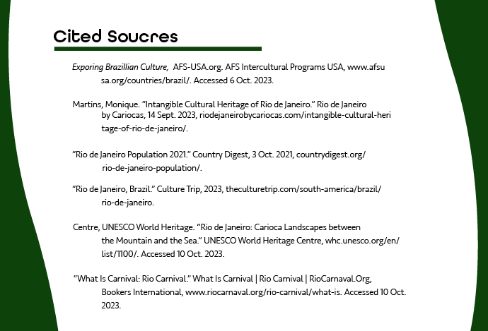
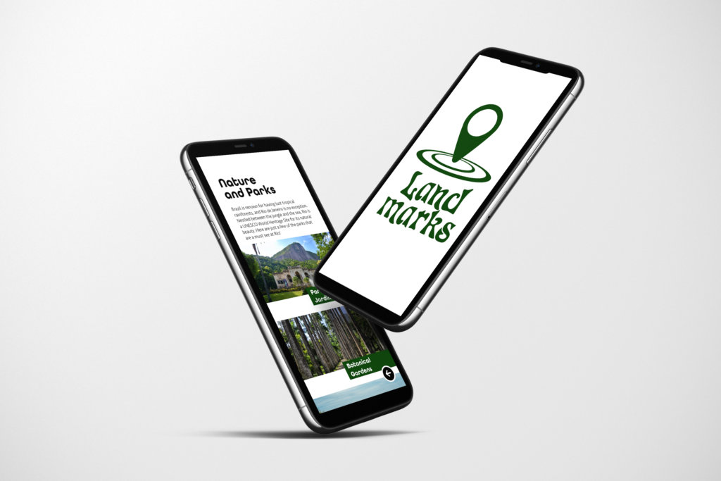
The location and destinations are the main subjects of the entire app, so of course research had to be done on Rio de Janiero. I looked into a wide variety of sources to gauge the significance of each cultural site and better understand the culture myself. This helped me know how to organize the information of each category in the app, ensuring that each feature was relevant and engaging.

Local Wireframing
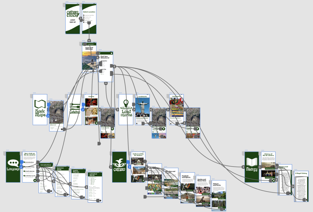
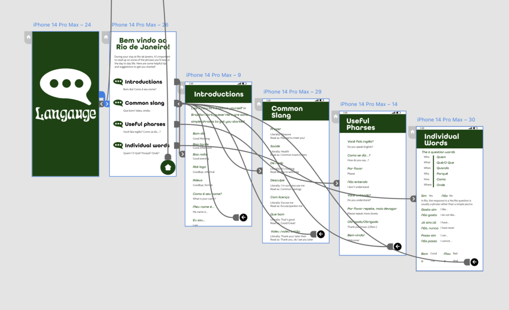
I made these wireframes in the Adobe application Adobe XD before it became defunct. Thankfully, I was able to recover the files of each page and wireframe, but the images themselves are unfortunately at a lower resolution that the original final product. Never the less, they still serve as an example on how the user would navigate the app.

Full Wireframing
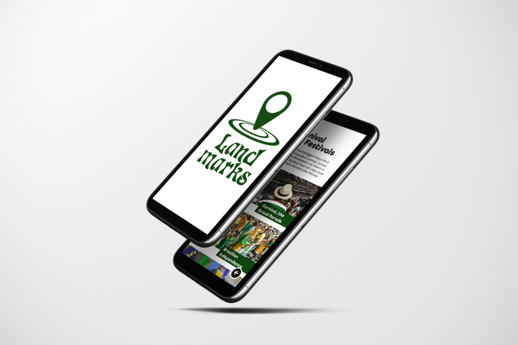
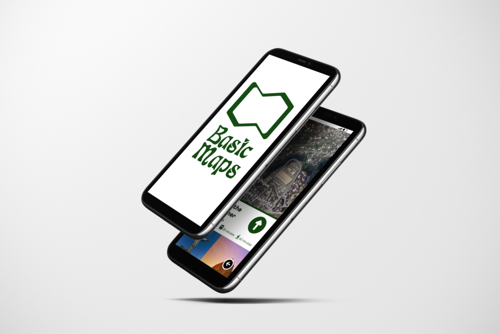
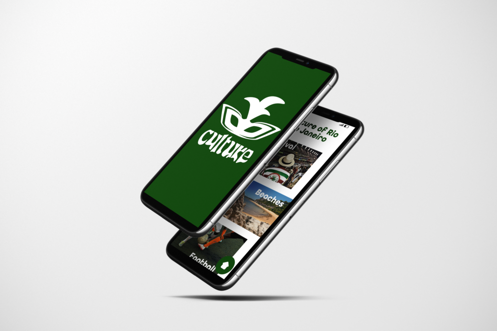
Each category would lead to a title screen and then a section, and each section had pages dedicated to the assigned service the app provided. Some categories are more directory in nature, while others are informative with more pages dedicated to them. On each page, there would be a back button to the designated section. On each section there would be a home button. A small page adjacent to the home page serves as a recommendation page that takes data given from the user's interaction with the app and suggests whatever categories they search the most. This is to provide for a streamlined experience for the user.


