FUTO Design Challenge
This is the FUTO Design Challenge, a redesign of a brand that was inspired by the design competition for the rising software company FUTO. In 2024 FUTO called on the graphic designers of the internet for a chance to win a prize to redesign their logo and brand. While I decided to back out of the competition at the time, I completed the branding project on my own, and here you can view the work I did for it.
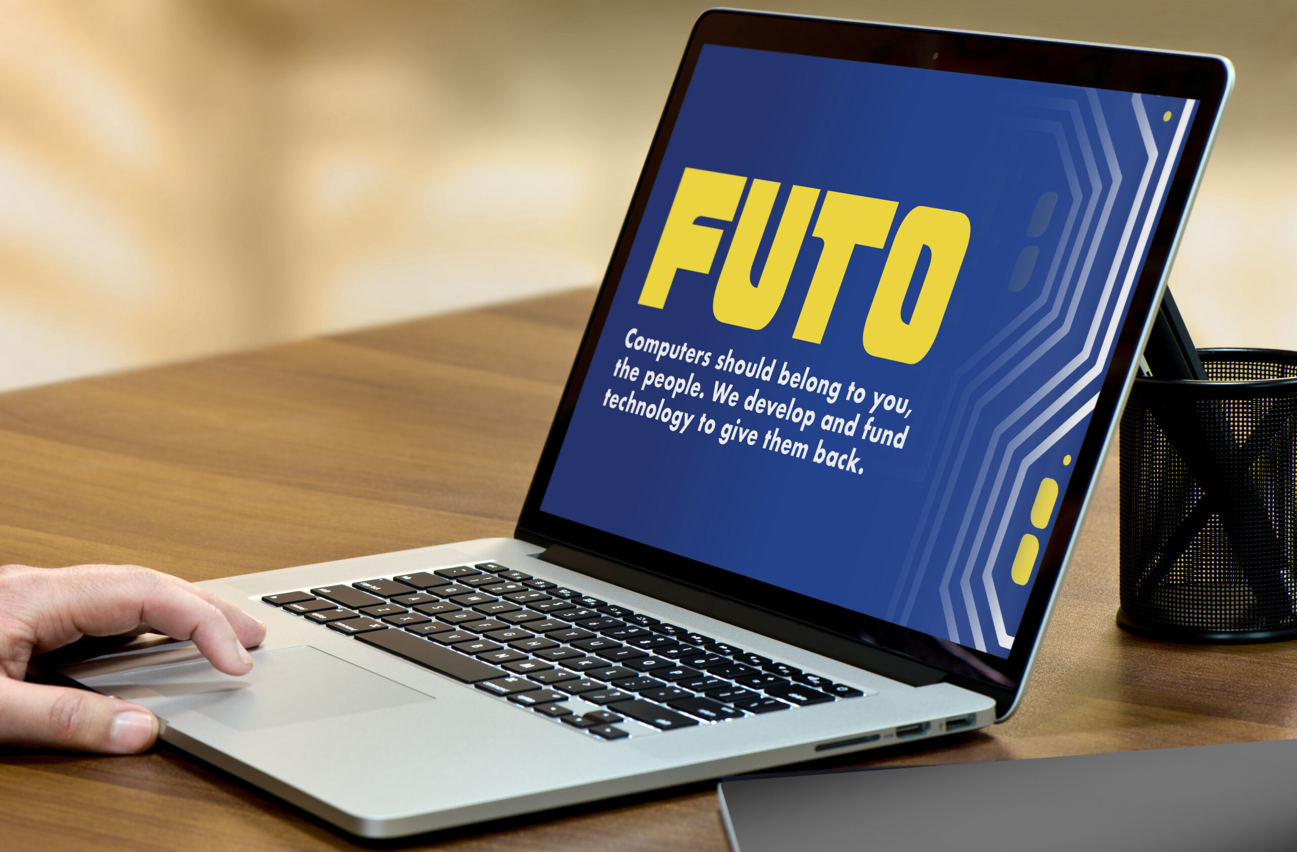
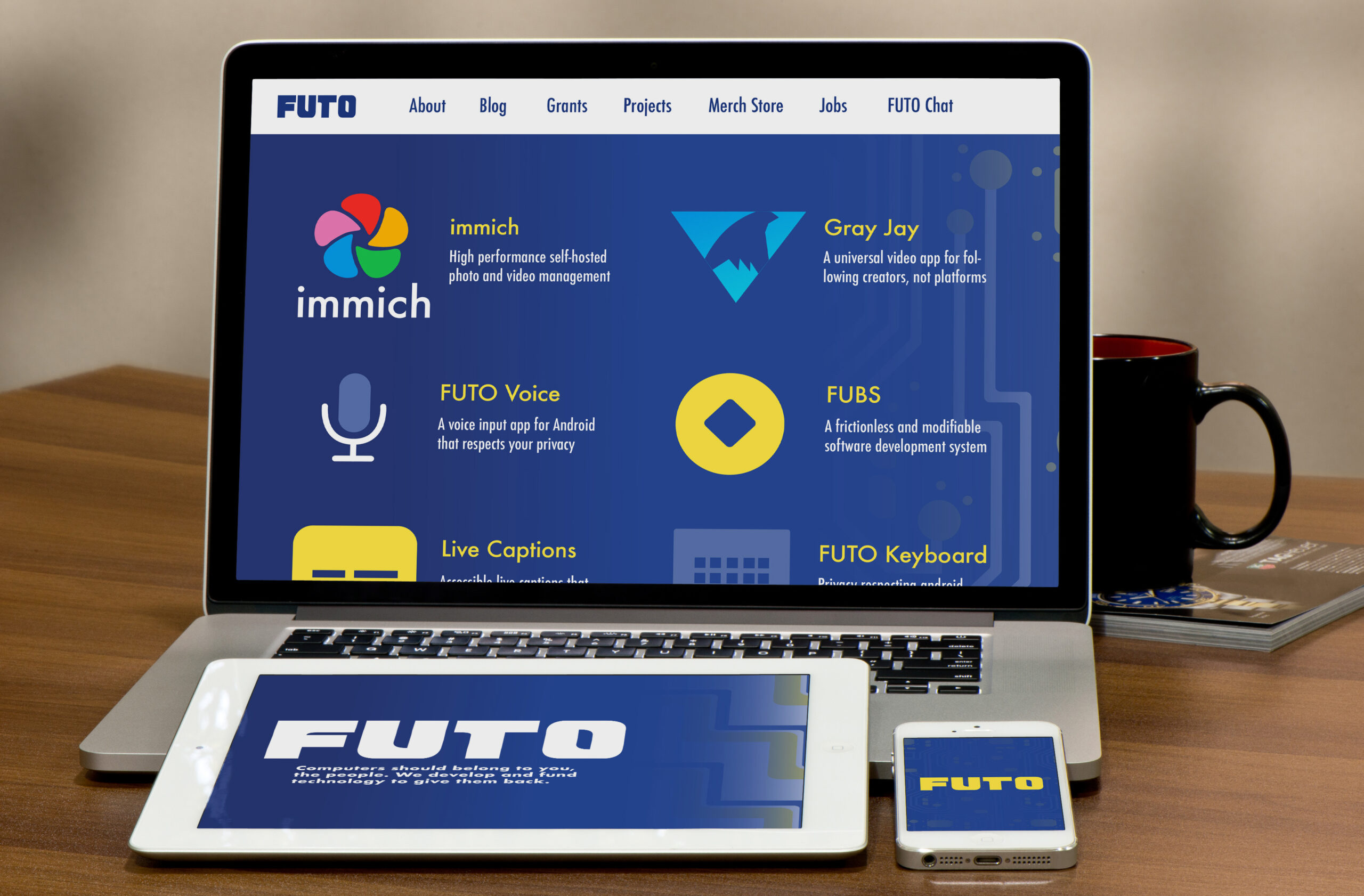
Mockups of Design
FUTO's Inspiration and Origin
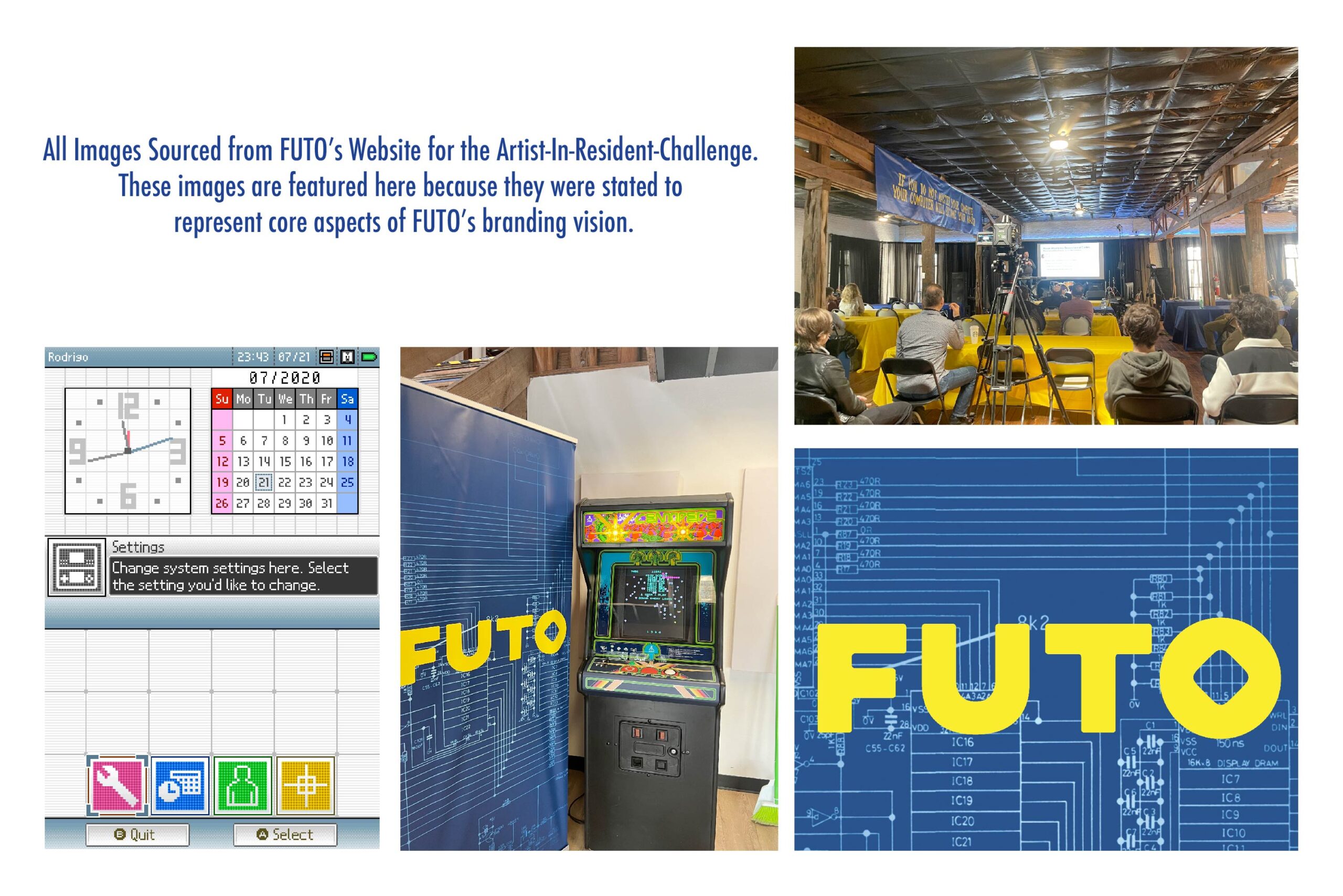
After graduating with a degree in Studio and Digital Arts, I was looking for avenues to exercise my design skills in when I found this challenge. What drew me to FUTO was the unique challenges the prompt gave. The goal of the redesign was to create a logo and branding identity that had to bring back the past and serve as the future of FUTO. The reference images given for the vision were all older graphics, arcade designs, and a UI design that harks back to late 90's computers. As a designer, I had to combine these elements with modern software design trends so that the new logo could compete with industry standards.
Brand Guide Pages
Logo Design
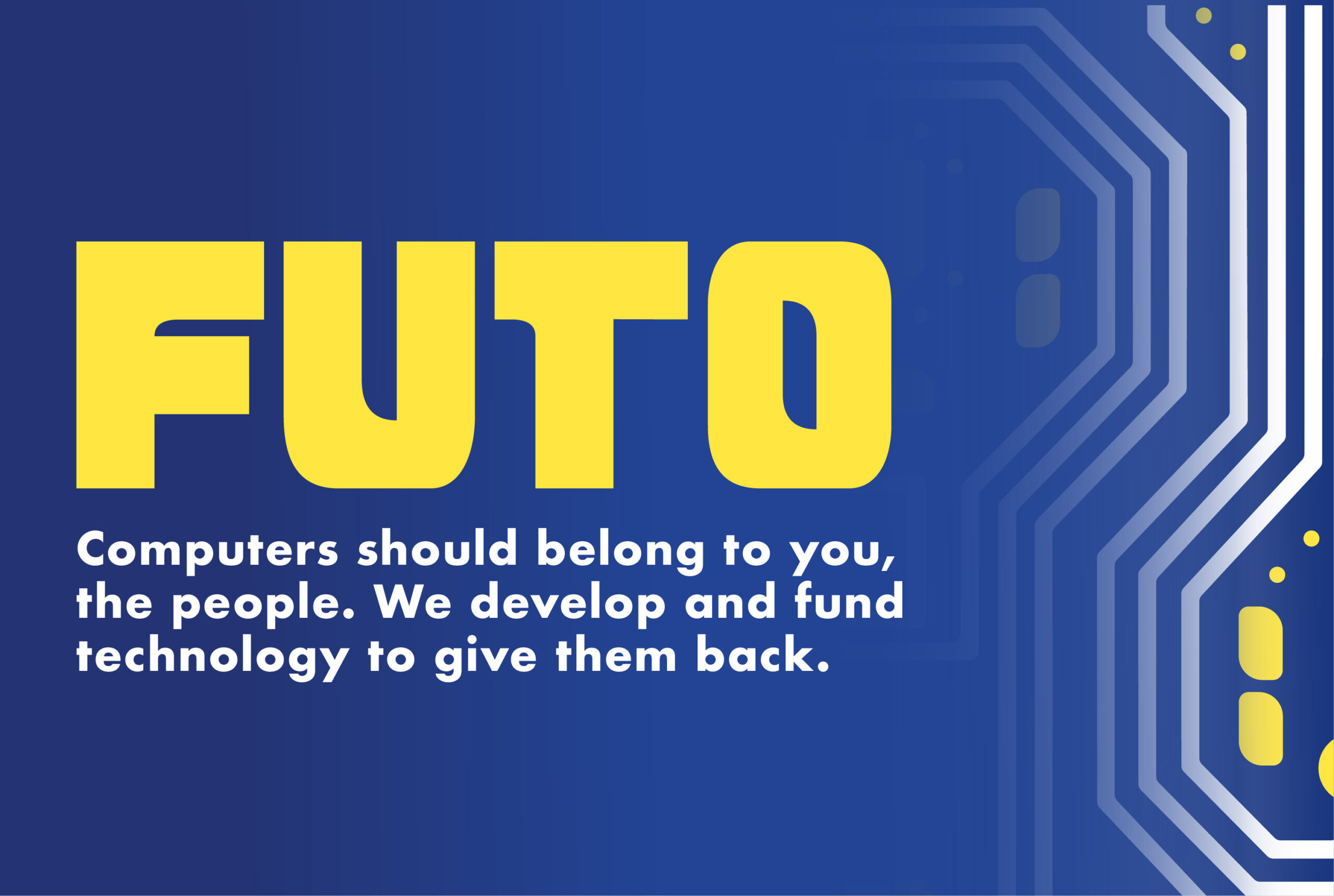
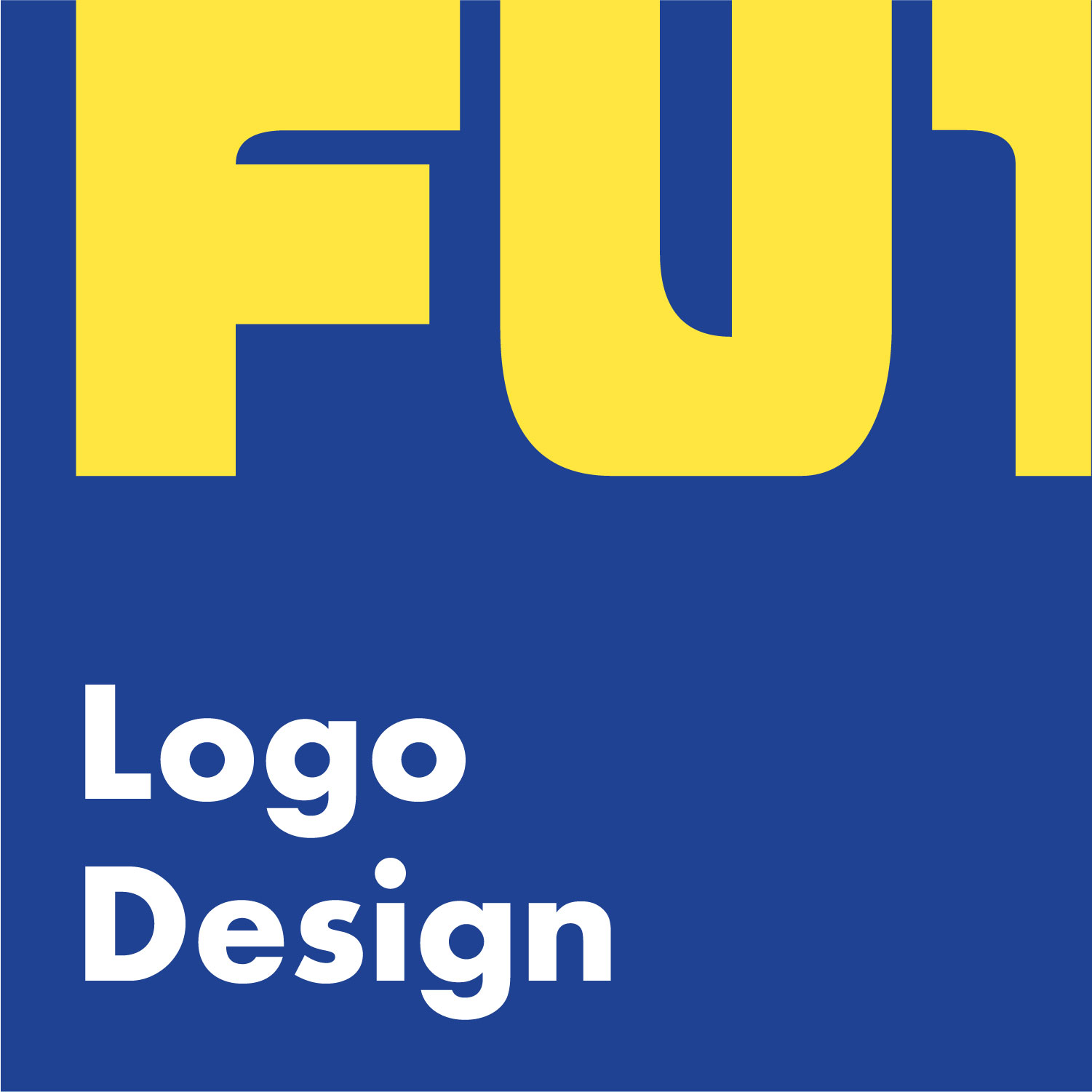
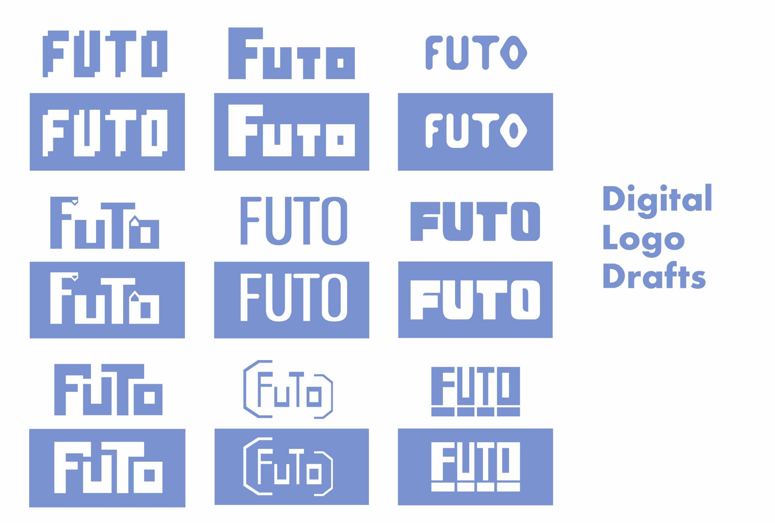
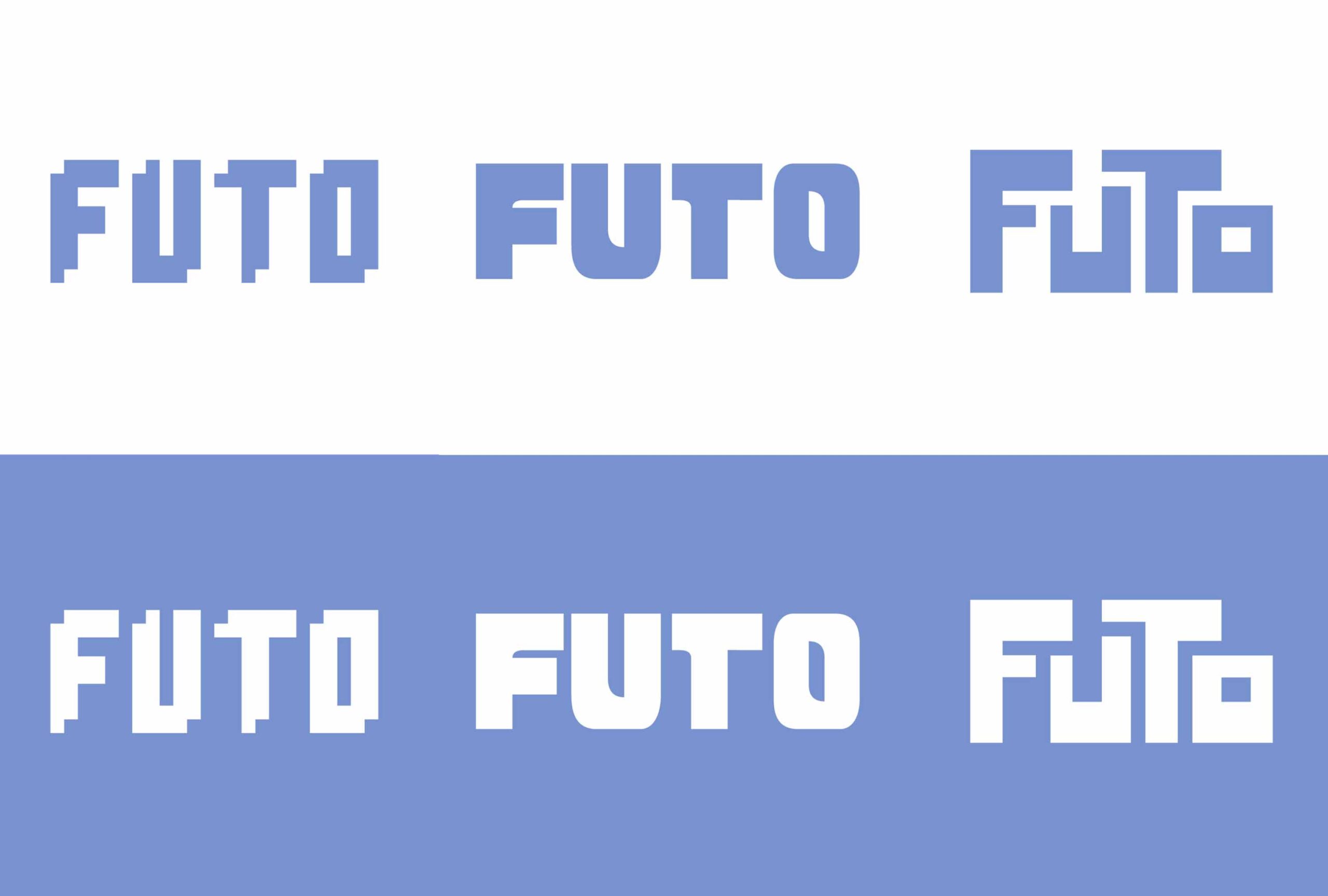
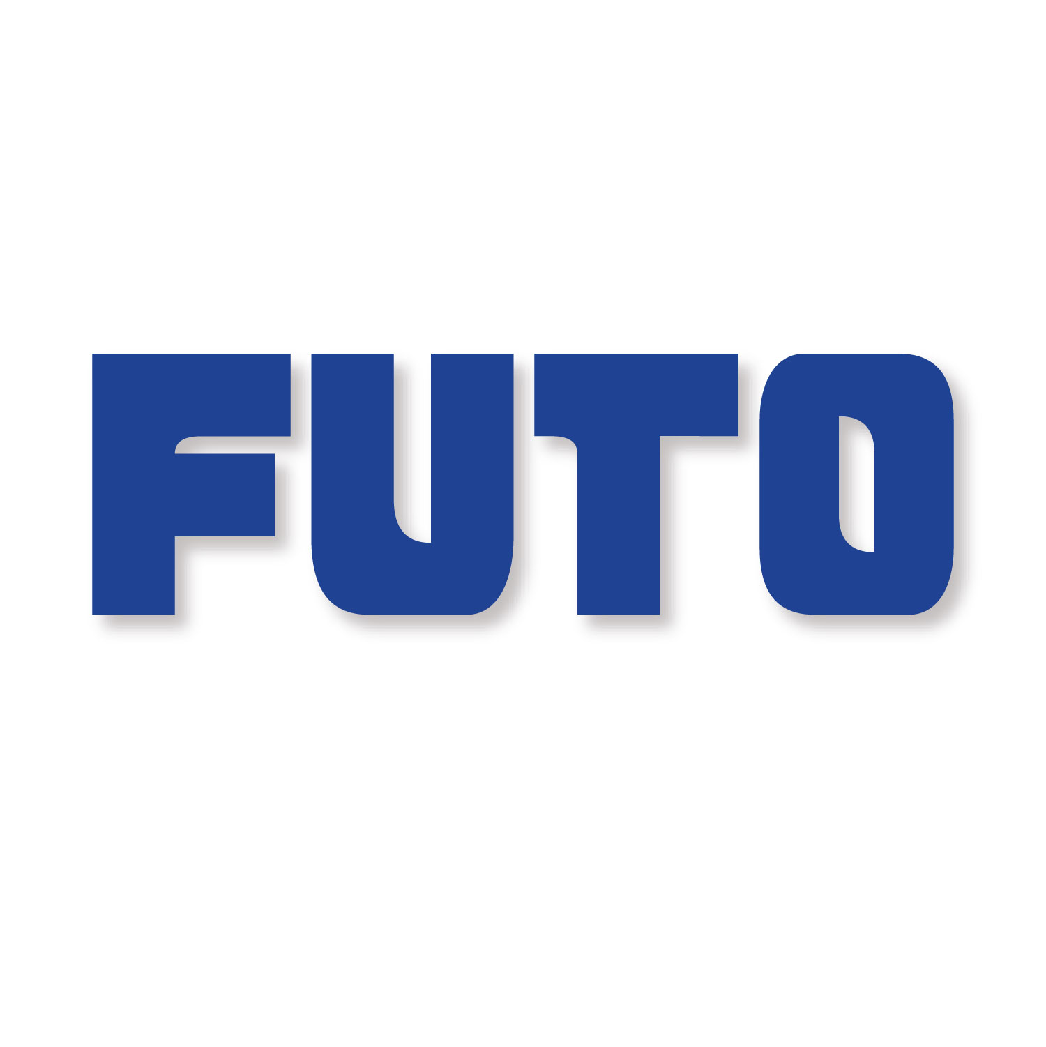
The final logos drew inspiration from typography trends of different times. The first logo drew inspiration from the bitmap fonts of the 80's, the second logo drew inspiration from retro arcade machine designs and modern logo design, and the last logo drew inspiration from the wacky experimentation style of the Y2K era. It was really hard to pick between these 3 because each one had such a different style and appeal to them. In the end, I chose the one that would be best suited in this modern era of software development design. Uniqueness is important, but a logo's first purpose is not to stand out, but to communicate to the audience what its company represents. FUTO is a bold company that takes inspiration from a past era of the internet to make better computer software for the people, and out of the three, the second logo represents that idea best.
Color Pallete
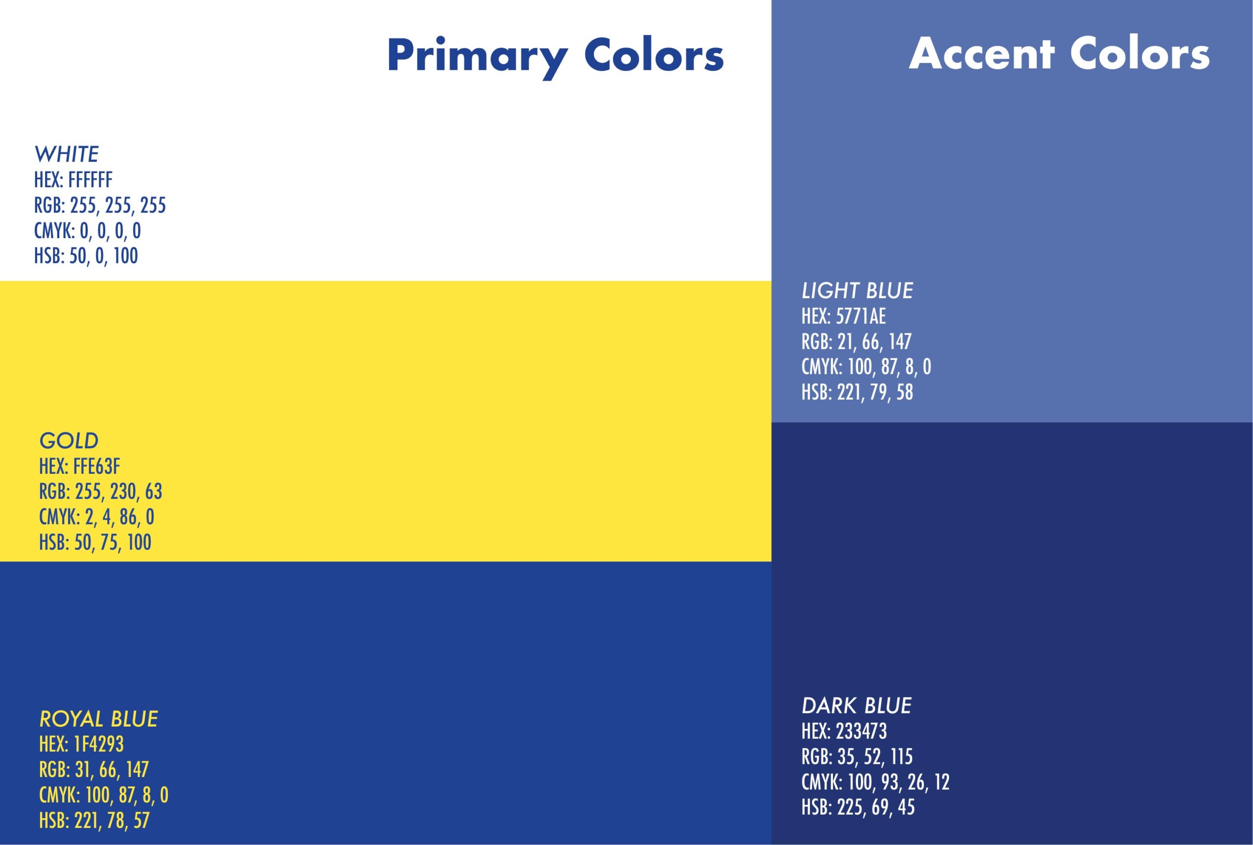
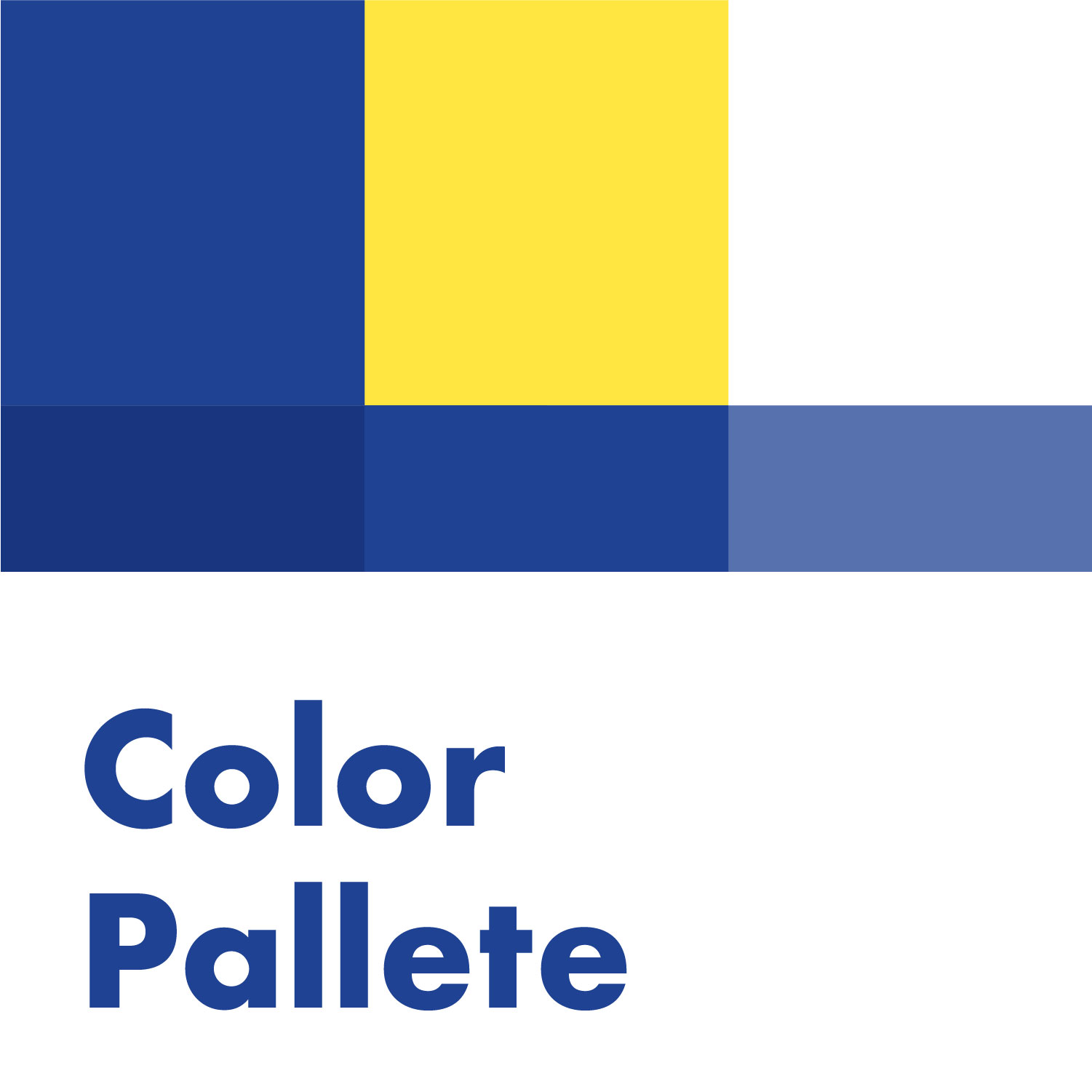
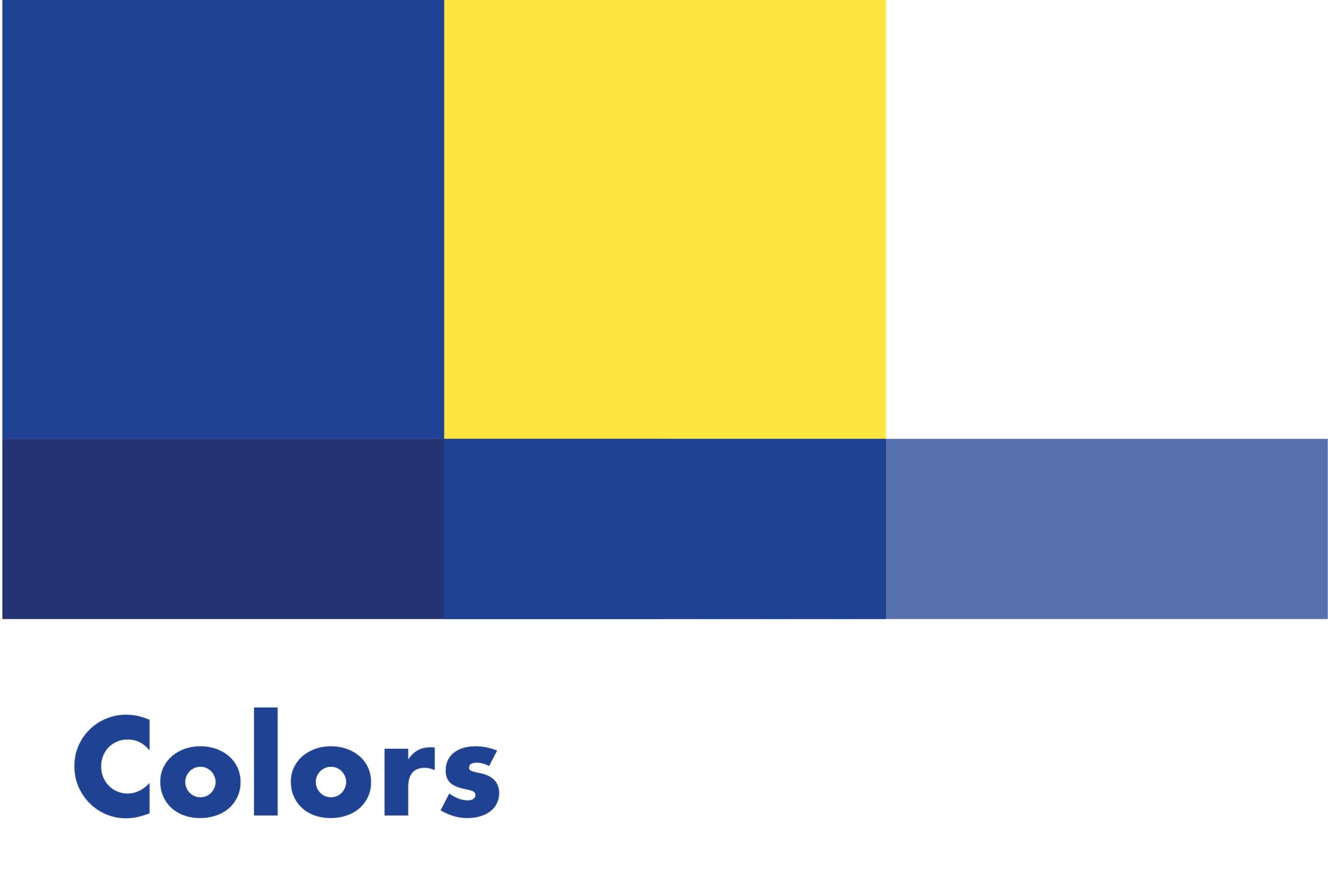
FUTO wanted to keep the same gold and blue color scheme of the original logo, so I did. I also added shades of blue and white to add variety to the branding. Dark blue, gold, and white are the primary colors and the shades of blue are the secondary color pallete.
Designs and Patterns
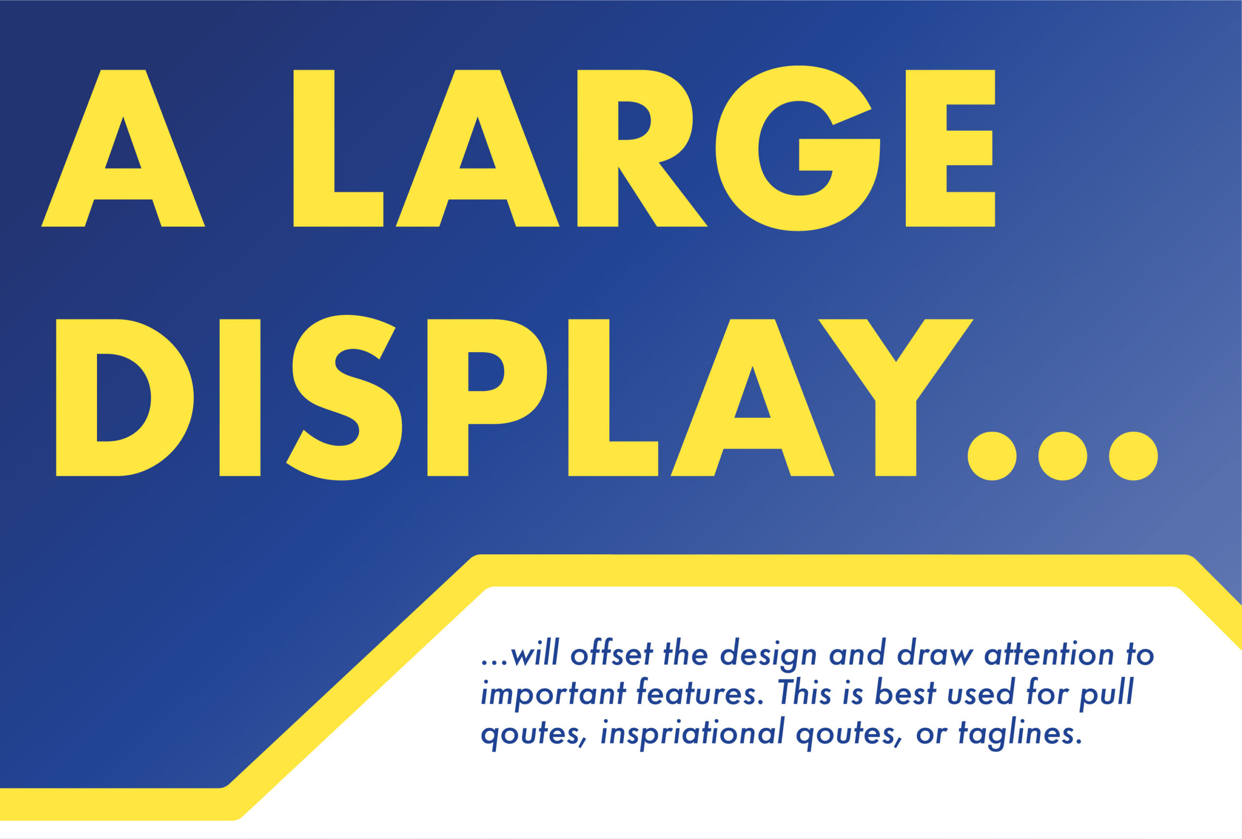
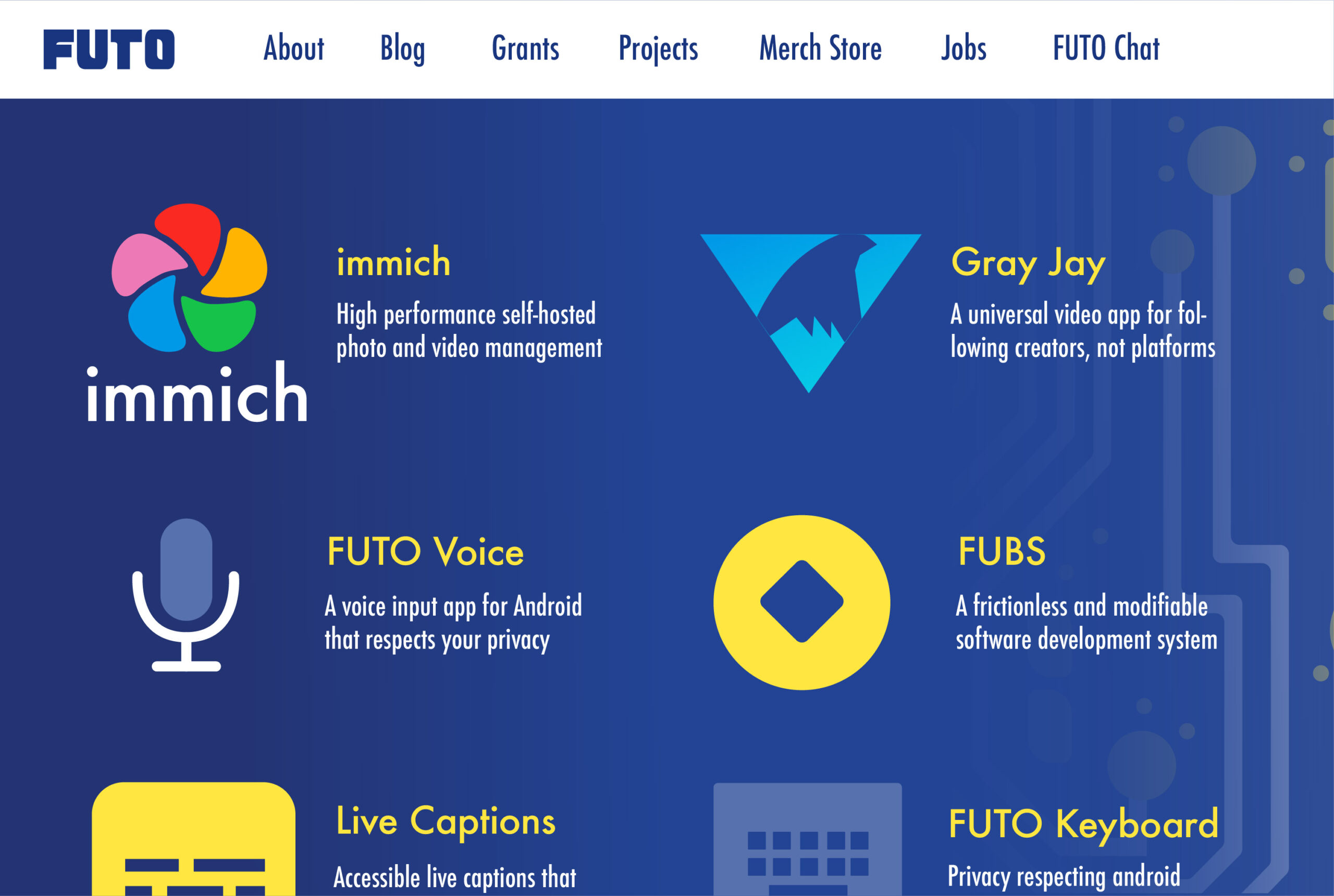
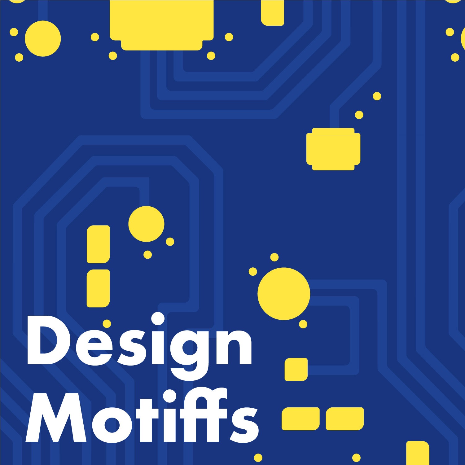
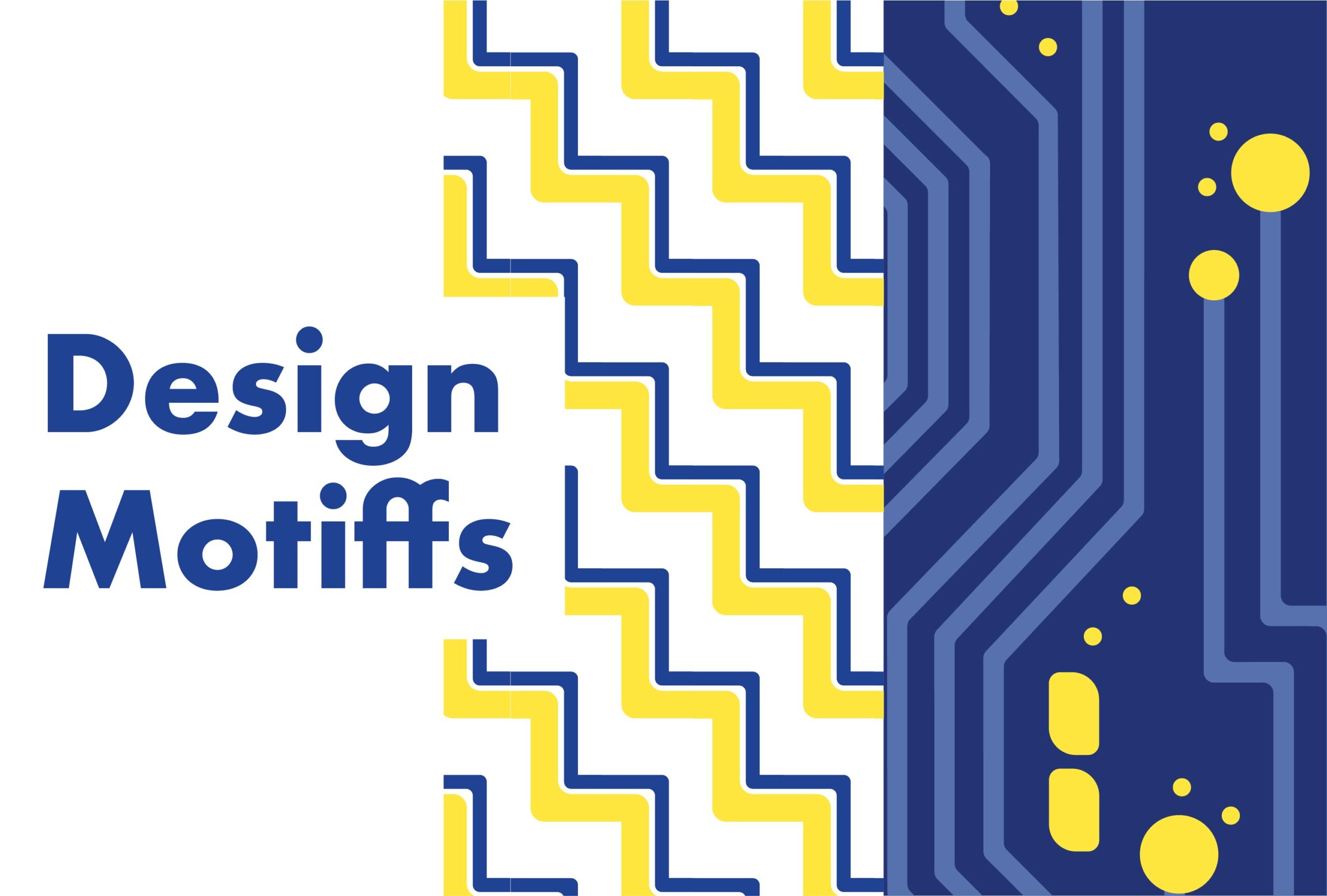
The design for FUTO needed to be minimal and strongly focused on text to fit into the modern design trend that most software companies follow. In addition to the text based elements I did create patterns that could be used to accentuate the backgrounds.
Typography
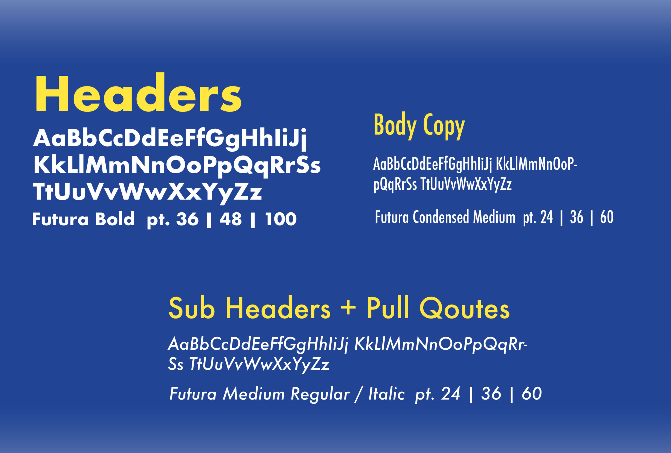
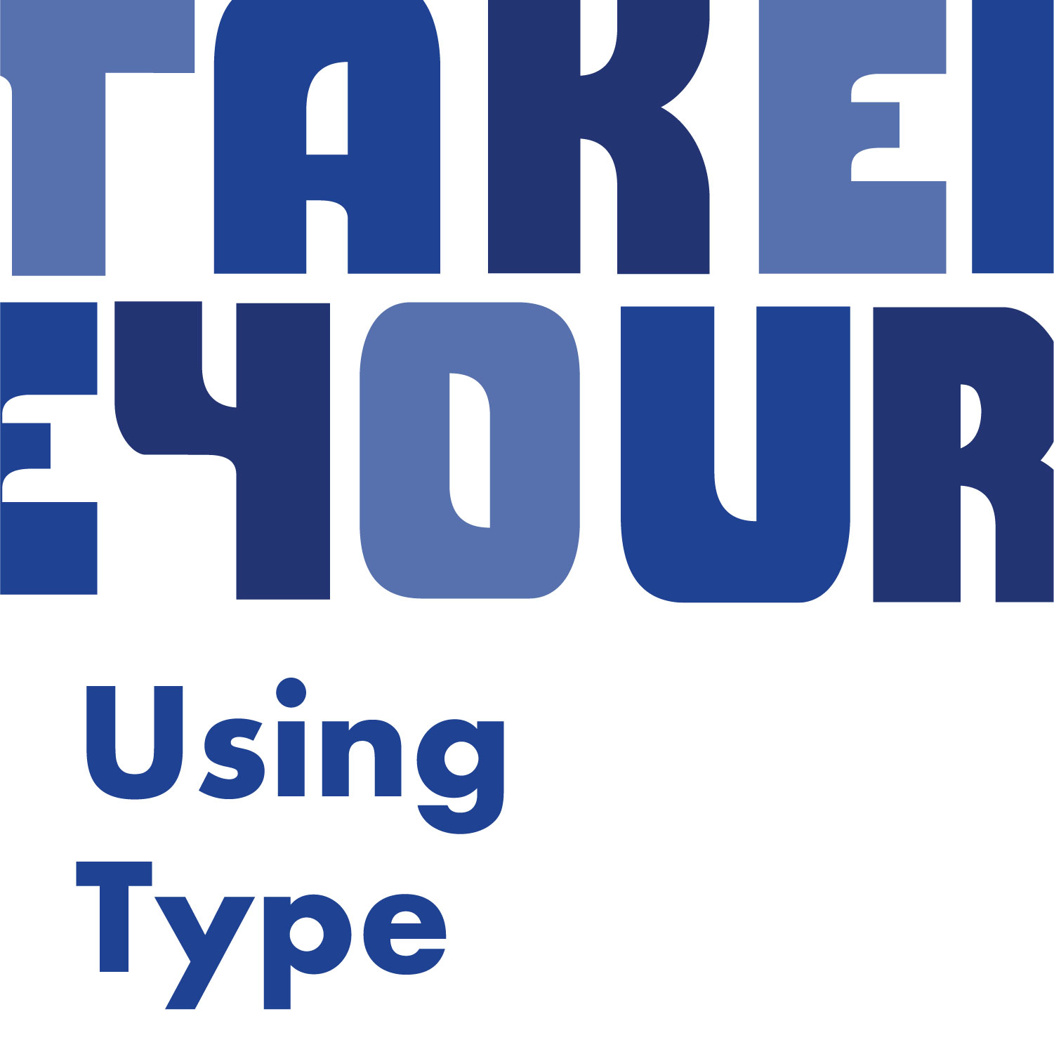
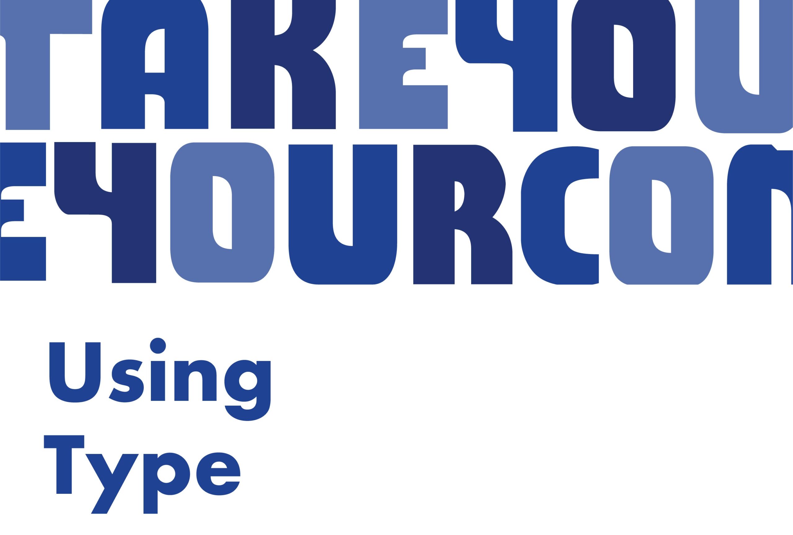
The typefaces chosen are meant to be bold, clean, and retro. Futura Bold matches the energy of the logo well, so it and it's other weights Medium and Medium Italic will serve as headers and sub-headers. I chose Futura Condensed for the body copy because of it's legibility and because it resembles older typefaces used in the early days of the internet.
