Hands of Extinction: Musuem Exhibition
Musuem Exhibits
Environmental Design
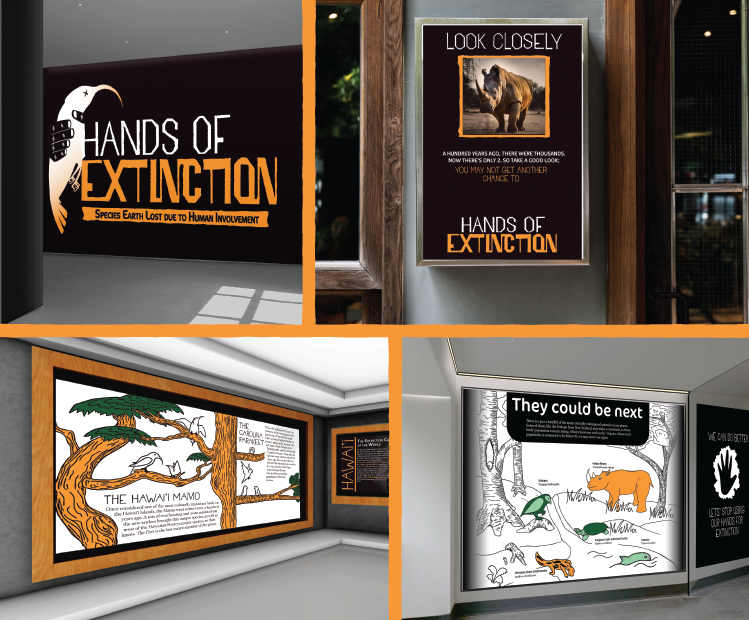
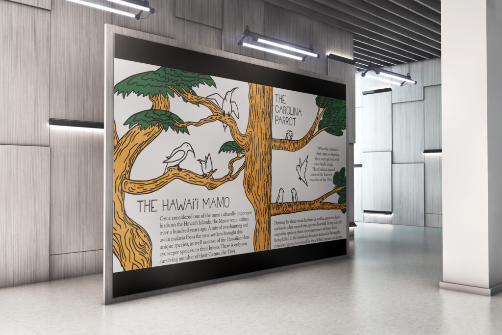
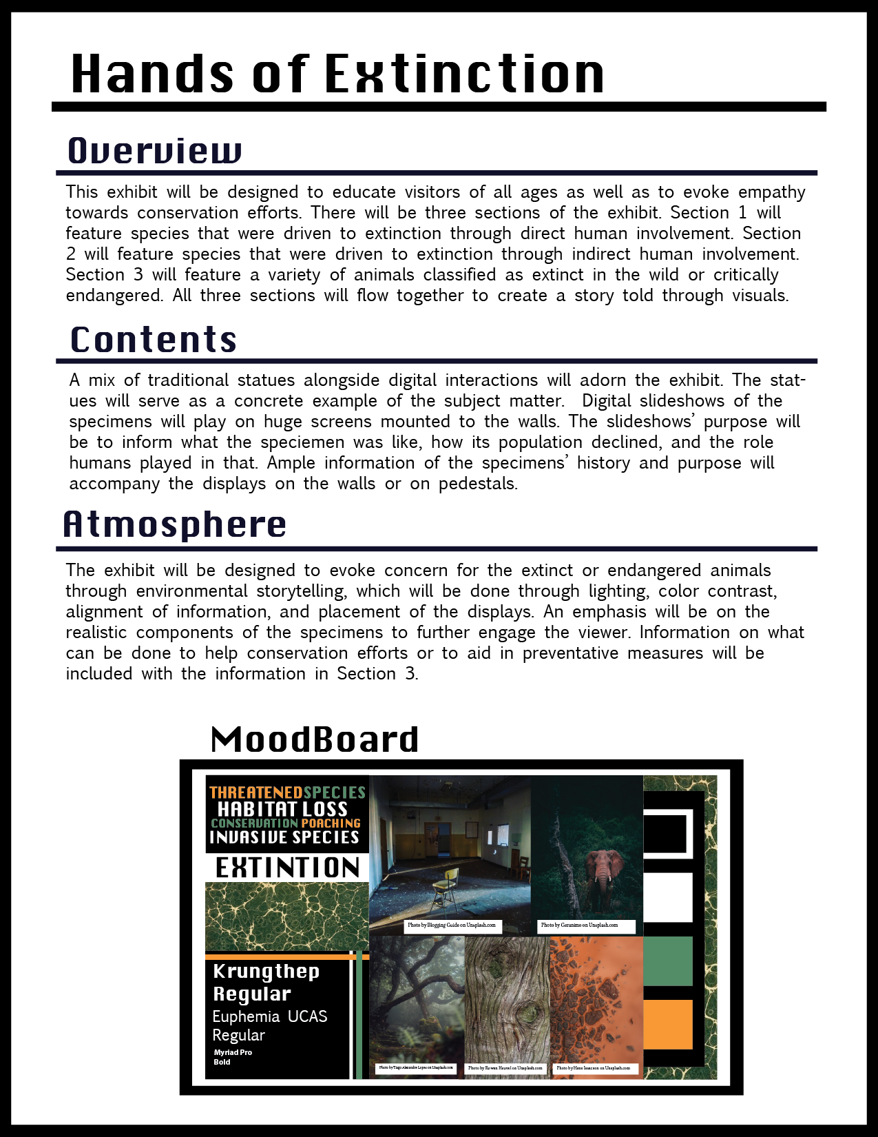
Hands of Extinction is my first dip into environmental design. In each step of the process, I had to consider how the audience would interact with the material. A large emphasis is placed upon the narrative feature and the emotion-driven language as a way to draw the audience in.
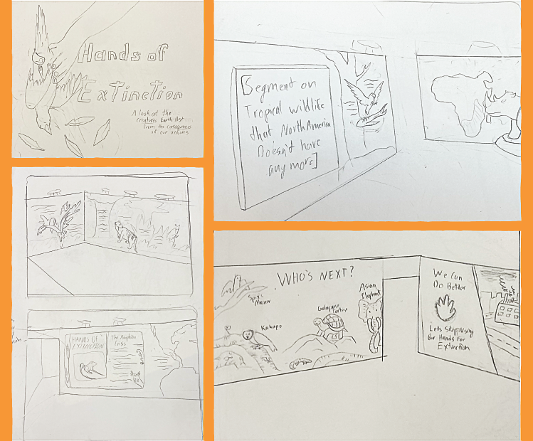
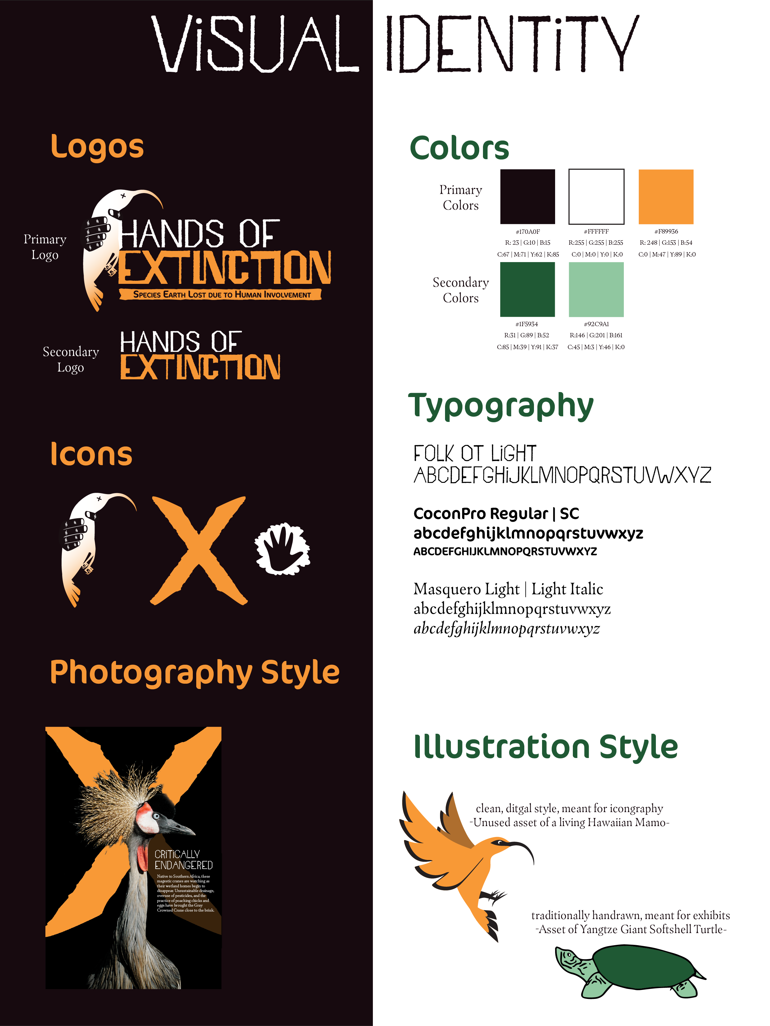
Below is the proposal and the visual identity for the exhibition. The proposal was made well in advance of the visuals, since I needed to get this project approved before I continued with the design, which is why the typography and color schemes are not consistent with the final design.
Elements of the Design
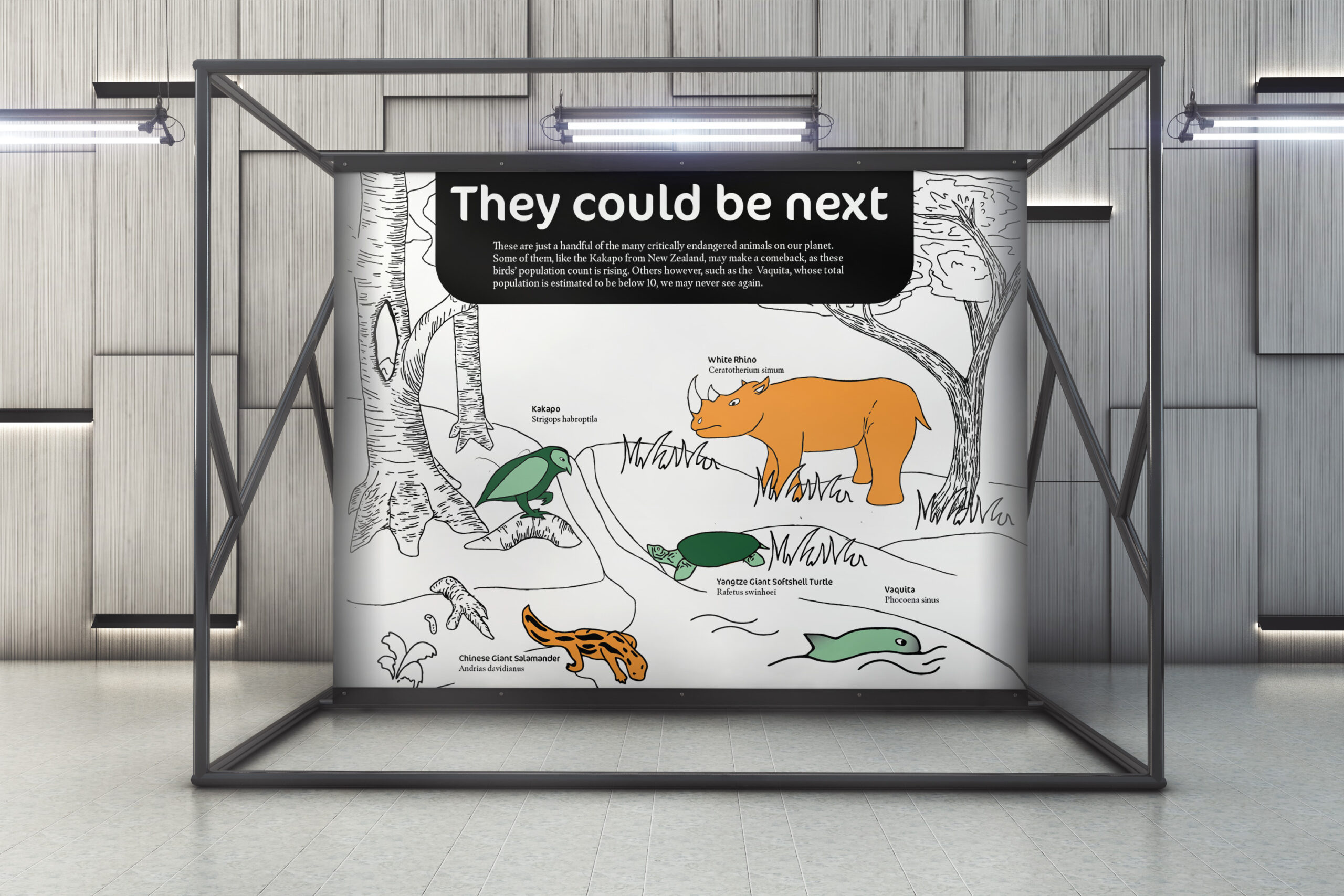
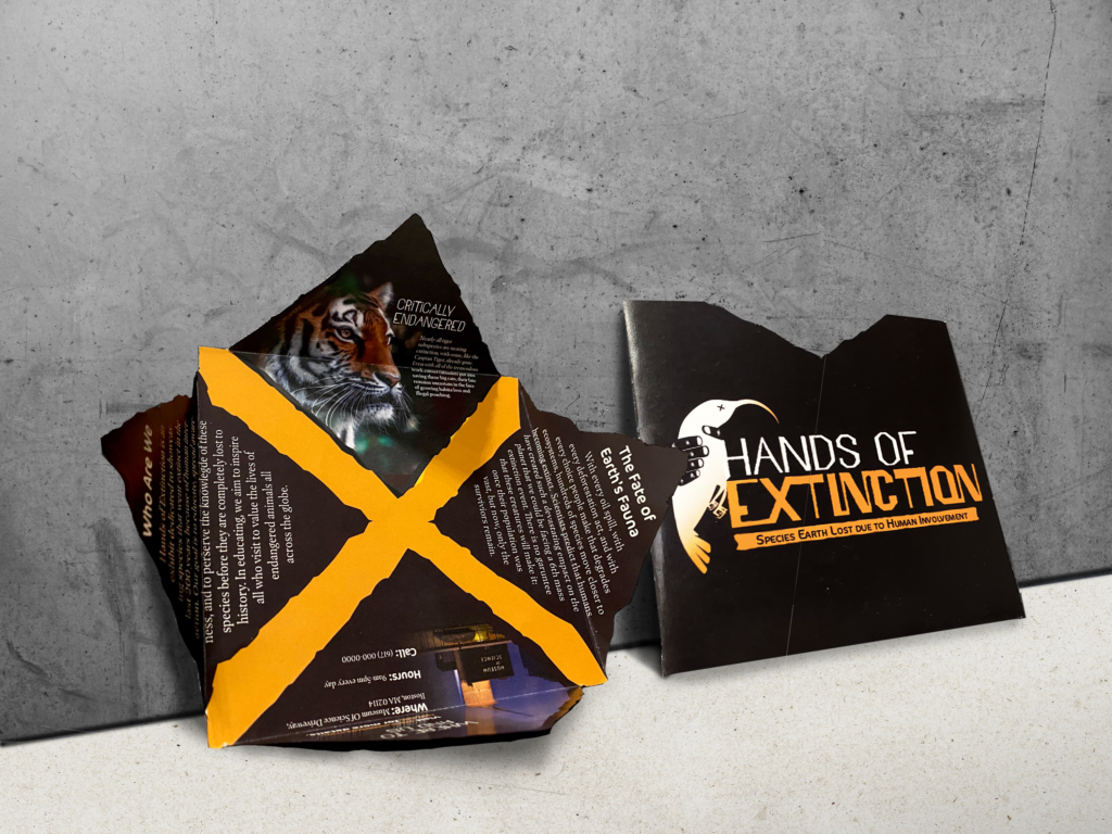
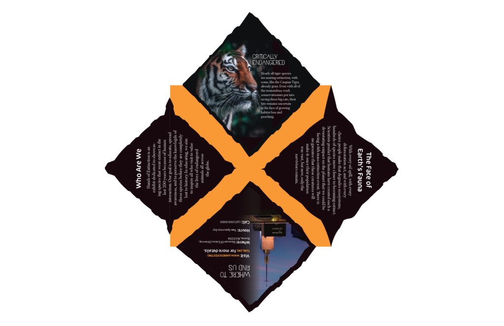
For this exhibition, I wanted lean into the dire nature of extinction and present the information in a way that invoked a sense of urgency. To accomplish this, I chose black, bright orange, and white to be the primary colors. Later research revealed that green was closely tied to nature exhibits of all kinds, so I added in two shades of green to act as secondary colors. While there is no strict guideline for color, green will mostly be paired with white and orange will mostly be paired with black, to ensure good contrast and consistency with color.
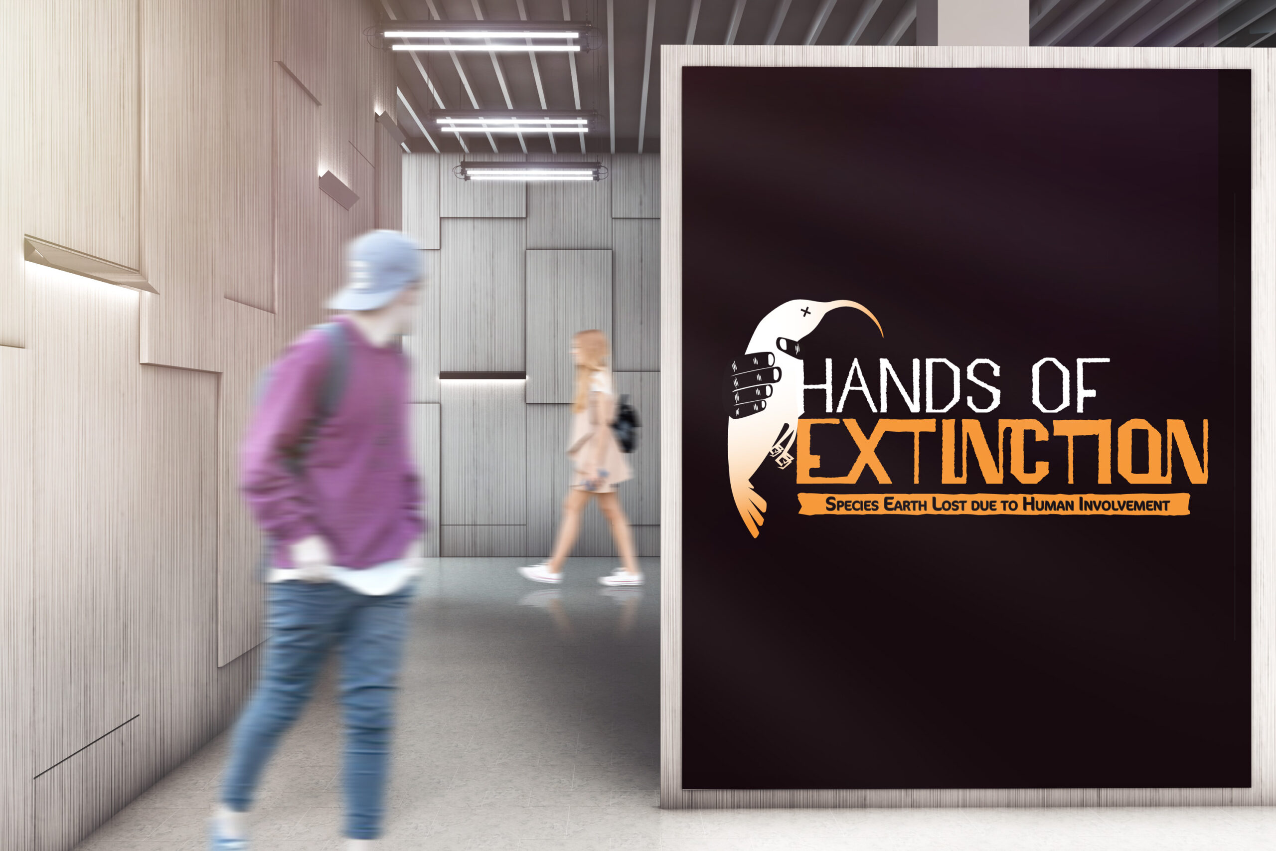
In most of the visual elements, an hand-drawn illustration style is used. For this project, I wanted to push myself outside of my usual illustration style, which is clean and digital based, and try a hand drawn style. The rougher, harsher illustration style was chosen to communicate the urgency and harshness of extinction. This visual technique is also seen in the logo and header typeface used throughout the exhibition. A clean and bold sub-header typeface is paired with the header typeface to ensure readability and contrast with the header.

Custom Handouts
